Overview
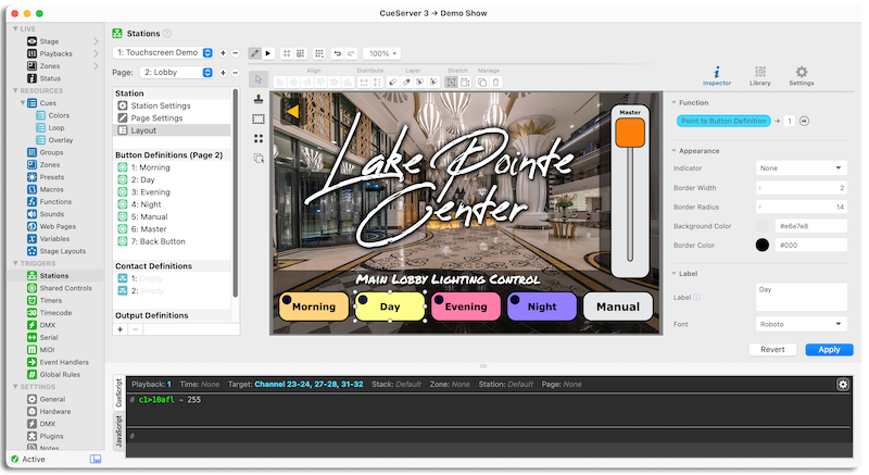
Every station has a virtual representation, called a Layout. These layouts can be static, as is the case with station 0 and hardware such as the DIO-588 module, hybrid such as with the Mystique/Ultra stations which can have digital labels, or entirely user-created and custom such as with our Insite Touchscreen and Custom Touchscreen station variants.
Inside of the Layout panel is the layout editor.
The layout editor has two modes of operation: Run and Edit. While in Run mode, the layout both operates and is displayed as it would be seen by a client. In Edit mode objects can no longer be activated and modifications are allowed.
The interface of the layout editor can be broken down into several components, each of which are covered in the sections below.
Toolbar
The double-decker toolbar spanning across the top of the editor contains various general actions across its first row, and more-specialized options pertaining to the currently targeted object(s) and tool(s) across the second.
To the right of the alignment, distribution, and layering tools is a “Resize” toggle. This toggle controls how transformations are applied when more than one object is selected. Specifically, the two transform modes are:
Transform Dimensions – (left) When selected, transformations will be reflected across all other selected objects proportionally.
Transform Position – (right) When selected, transformations will be applied to the entire selection, such that resizing the bounding box alters the positions of the underlying objects.
Inspector
This area contains the Inspector or Properties Panel, Object Library, and Settings panel.
The Inspector/Properties Panel contains the current properties of the selected object(s). Use this panel to customize objects with different colors, labels, shapes, and styles.
Mixed Values
When more than one object is selected, the combined properties of all selected objects will appear. In cases where the value for a field differs across two or more selected objects, the field will display an ellipsis (…) in place of the value to indicate this mixed state.
Mixed fields can be modified, however it is important to note that any changes to a mixed field will also be applied to any other selected objects sharing that same property.
Variables & Default Values
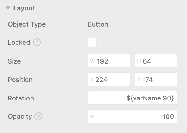
Most inspector fields support the use of Variables and Default Values. To insert a variable, use the variable escape ${escape} syntax. You can optionally set a fallback/default value by adding a bar character ( | ) followed by the value:
When a value has a variable defined (with or without a fallback value), adjusting that property using other methods (i.e. drag, arrow keys, etc) will update or define the new value as the default or fallback value.
Function
Layout objects can optionally be “linked” to a resource or perform an action.
In the layout editor, this is called an object’s Function.
By default, each object will be initialized with a function of None. Objects that do not have a function are purely decorative in that there is no cursor response and they do not “block” press or tap events from reaching objects below them.
Press or tap on None to begin constructing a function.
If the selected object is a complex object, such as a Slider or Color Picker, Adjust will be available.
The Adjust option allows for mapping user interaction to Channel, Group, & Fixture levels, variable values, and other items depending upon the object type.
The possible targets for an Adjust action are:
- Channel
- Effect
- Fixture
- Group
- Preset
- Submaster
- Variable
- Button
- Shared Control
- Current Selection
For objects with binary push-style interactions, the following options are available:
- None – make this object non-interactive.
- Perform CueScript – perform CueScript whenever this object is pressed in the provided context.
- Perform Macro – perform a Macro whenever this object is pressed.
- Go to Page – switch the current station to the provided page number.
- Point to Button Definition – make this object reflect the provided button resource.
- Point to Contact Definition – make this object reflect the provided contact resource.
- Point to Output Definition – make this object reflect the provided output resource.
- Point to Shared Control Definition – make this object reflect the provided shared control resource.
- Select… – make this object select a resource in the provided context and playback.
- Toggle… – make this object toggle a resource in the provided context and playback.
For most options, such as with Select, Toggle, and Adjust, it is required that a target be provided.
The function target field accepts any of the following types:
| Type | Example |
|---|---|
| Number |  |
| Variable |  |
| CueScript Selector |  |
In some cases, you may be prompted to select a context.
A context is a persistent state that stores details such as the current selection, global timing, active station, and more. When a selection command is executed (i.e. Channel 1), the context remembers that selection and applies it to any subsequent commands (i.e. At Full).
Available Contexts:
Default – The primary context used by CueServer Studio. This is the context that appears in the status ribbon, above the command line.
Temporary – Disposable context used only during execution. State changes persist only for the duration of execution.
User 1 – Persistent, user-defined context that can be assigned for any use.
User 2 – Persistent, user-defined context that can be assigned for any use.
User 3 – Persistent, user-defined context that can be assigned for any use.
User 4 – Persistent, user-defined context that can be assigned for any use.
Stroke & Fill (Colors)
Most objects have one or more components that can have colors applied to them. Color fields store colors in hexadecimal format (i.e. #FF0000), but they can also accept rgb values (i.e. rgb(255, 0, 0)) or even variables.
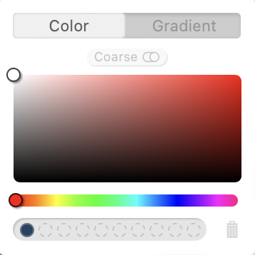
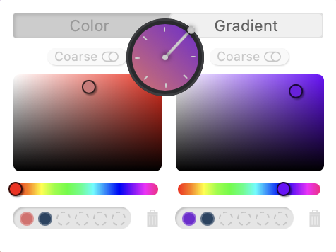
Press or tap on the color well to open the color picker:
Recently-used colors will appear across the bottom.
Press or tap a color in the list to recall that color into the selected field. Use the trash icon ( ) to clear the list.
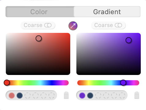
Use the Color / Gradient toggle to switch between Single-Color and Gradient modes:
Switching to Gradient mode will cause a second color picker to appear to the right of the original. In this configuration the left-most color picker represents the “start” color, while the right-most color picker represents the “end” color.
Use the angle button () to open the angle-selection tool and rotate the gradient:
In some cases it is useful to copy colors between objects and properties. Color fields provide three ways do this:
1. Right-click on the source-color and select “Copy Color” then right-click on the target color and select “Paste Color”.
2. Select and copy the text from each source field and paste the contents into the target color’s fields.
3. Drag-and-drop directly from one color well to another color well.
Opacity
Every layout object (excluding physical stations) has an opacity property that can be used to determine how visible an object is. This can be used for stylish effects, or for more advanced cases it can be used for dynamic content.
Example: Dynamically Show/Hide Buttons
1) Place two buttons of the same size and style at the same location within a layout.
2) Assign each button’s “opacity” property to the variables buttonA & buttonB.
3) Use CueScript to toggle the visibility of the buttons:
if ('mode' == 1) then
    set buttonA 0
    set buttonB 100
else
    set buttonA 100
    set buttonB 0
endif
Object Library
The object library contains all of the objects that can be used in the layout.
The available plugins are:
| Button |  |
Standard push-button control for triggering actions. |
| Clock |  |
Clock that displays the current time. |
| Color Picker |  |
RGB Color Picker control. |
| Ellipse |  |
Decorative ellipse. |
| Fixture |  |
Decorative object representing a fixture in 2D space. |
| Icon Button | |
Button that appears as a scalable icon. |
| Image |  |
Decorative image. |
| Image Button |  |
Push-button control with configurable images for each state. |
| Line |  |
Decorative line. |
| Rectangle |  |
Decorative rectangle. |
| Slider |  |
Slider control for controlling variable levels. |
| Text |  |
Decorative text. |
| Toggle |  |
Standard toggle control for turning something on and off. |
| Touch Area |  |
An invisible area that can trigger events. |
The following objects are only available inside of station layouts:
| Station |  |
Embedded station. |
| Page Nav |  |
Page navigation object. |
To add an object to the layout, click-and-drag the object to place it on the layout.
To remove an object, select the object inside the layout and hit the “Delete” key, or press the trash button ( ) in the Toolbar.
Settings
The settings panel contains various options and variables that alter how the layout editor functions.
The available options are:
- General
- Wireframe Mode – Renders a wire-frame of each object (for debugging purposes).
- Selection Padding – Sets the bounding-box offset in pixels from selected object(s).
- Paste/Duplicate Offset – Sets the number of pixels to offset pasted objects within the same layout.
- Enable Dragging – Enables/Disables the ability to drag objects.
- Enable Resizing – Enables/Disables the ability to resize objects.
- Enable Rotation – Enables/Disables the ability to rotate objects.
- Alignment Guides
- Enabled – Enable/Disable the alignment guides.
- Objects – Enable/Disable snapping to nearby objects.
- Background – Enable/Disable snapping to the background X/Y center.
- Maximum Velocity – Maximum velocity at which alignment guides will be activated (lower = less sensitive).
- Grid
- Visible – Show/Hide the grid.
- Snapping – Enable/Disable the snap-to-grid functionality.
- Type – Sets the grid type to either a dot-matrix or a grid.
- Size – Sets the grid size.
- Units – Defines whether the grid size unit is relative to the layout or absolute.
- Opacity – Sets the opacity/transparency of the grid.
- Color – Set the color of the grid. When set to Auto, the grid color adapts to the background.
- Accessibility
- Reduce Motion – Disables any unnecessary motion and/or animations throughout the editor.
Tools
This sidebar-area contains the various tools along the left-hand side that can be used to speed up the creation of customized pages and layouts:
| |
Selection | Default. Selects and moves objects. |
| |
Clone Stamp | Clone selected objects to selected location. |
| |
Plot Tool | Plot objects around or inside a shape. |
| |
Multi Tool | Add & place multiple objects at once. |
| |
Copy Attributes | Copy attributes from source object to destination object. |
Selection Tool
The Selection tool is the default tool, and it’s used for basic layout editing. Use the Selection tool to select, move or resize objects within the layout.
When the Selection tool is active, you can also engage the Lasso by performing a press-and-drag operation originating from the background.
Clone Stamp
The Clone Stamp tool replicates a selected object (or objects) at the selected location. When cloning objects that are linked to resources such as Buttons or Fixtures, the Clone Stamp tool will also increment the linked ID to the next available ID of that type, unless there is no next item available, in which case the ID is simply incremented by one.
When cloning more than one object, each object is incremented to the next available resource ID in-order from left-to-right.
Once activated, select an existing layout object as the source object, or use the Select button ( 
Use the Next ID field to select the starting ID for the next placement and the Increment checkbox to enable/disable the auto-increment functionality entirely.
Plot Tool
The Plot Tool allows for plotting objects around or inside of other objects.
To use the plot tool, activate the tool and then drag an object from the Object Library and drop it onto the target shape. When dragging the object over the layout, objects/shapes that are compatible with the plot tool will become highlighted while hovered over.
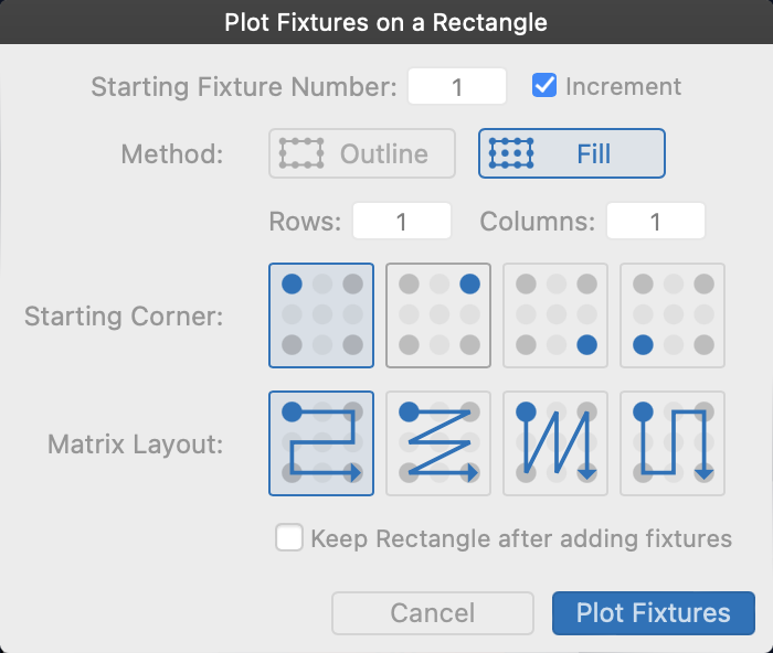
Upon dropping the object onto a target shape/object, the plot wizard will appear to customize the plot operation:
Depending upon the target shape, you will be presented with one or two options:
 |
Plots objects around the rim of the target shape, or along the shape for open shapes. |
 |
Plots objects inside the target shape, using rows and columns. |
When the object being plotted is a Fixture, the Starting Fixture Number and Increment options will appear at the top of the plot wizard. The number specified is the fixture number to assign to the first plotted fixture, with each following fixture being assigned the “next” fixture unless the Increment option is unchecked.
In Outline mode, use the Angle selector ( ) to choose the angle in which the objects should be plotted.
In Fill mode, use the Rows and Cols fields to determine not only how many objects will be plotted but also how packed the objects are along each axis. Additionally, use the Starting Corner to change where the first object is placed, and the Matrix Layout to choose the flow of objects and in which order they are plotted.
In many cases an object or shape is used only for the purposes of plotting, in those cases ensure the “Keep (object) after adding fixtures” option is unchecked to automatically dispose of the target shape after the plot operation has completed.
Multi-Tool
The Multi-Tool allows for adding more than one object in a single action. This tool is useful when you need to place a group of objects with contiguous ID’s.
While the Multi-Tool is active, use the “Number of Copies” field in the Toolbar at the top to define how many objects should be placed.
When using the Multi-Tool with Fixture objects, a dialog will appear after you select a location to choose a starting Fixture number. The selected number will be used as the first fixture object’s fixture number, with each successive object being assigned the next-available patched fixture number — or the next number if the end of the fixture patch is reached.
Copy Attributes
The Copy Attributes tool copies attributes from a chosen source object to a destination object.
Once the Copy Attributes tool is activated, select an existing layout object as the source object, or use the Select button ( 
Use the Attributes to Copy section of the toolbar to select which attribute types to copy to the destination object.
The four types are:
- Size – The source object’s width, height, radius, etc.
- Appearance – The source object’s colors, label colors, style choices, etc.
- Function – The source object’s action/linked resource(s).
- Config – The source object’s component visibility, label editing, animation options, etc.


